More Theme Changes in Ubuntu 8.04
If you’ve been running the Ubuntu 8.04 Beta, you’ll have noticed that the default theme has been changed from the new Human-Murrine back to the same Human theme from previous releases.
Many users
complained
when the Human-Murrine theme was completely removed from the repositories. Now
it’s back to being installed, but not the default. You can re-enable the
Human-Murrine theme by selecting it in the Theme tab of Appearance
Preferences.
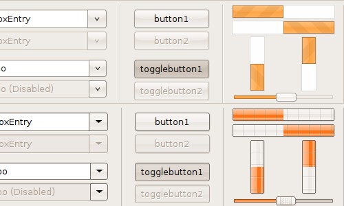
Here’s a comparison of Human-Murrine (top), and Human (bottom):

Which theme would you like to see as the default in Ubuntu 8.04? I don’t particularly like Human-Murrine but it would be nice to have a change, after all Human has been the default for almost 2 years now.
Archived Comments
BackwardsDown
I really like the Murrine theme but as long as I can choose it without too much hassle I won’t be complaining.
Arp
I like the bars in Human-Murrine, but the other items, especially the pulldown arrows, is better in Human. I may just be a sucker for the Web 2.0 stripe action.
Anonymous
I would like to not only have human-murrine available, but also the human-clearlooks theme, which in my opinion was quite nice as well.
Leszczu
They should definitely use Human-Murrine as default, it’s nice and look better. I never liked Human Theme, besides as you said, it’s been with us for very long. I would gladly see something new in 8.04
frewsxcv
I don’t like human, just because it’s a little ‘too’ glossy and i like the colors on human-murrine better.
MadsRH
I love the Human-Murrine theme! It looks very professional.
Ubukool
I don’t like Human-Murrine, it’s too flat and boring. The bars and sliders of Human are far more interesting. I really like orange as well which helps!
myddewji13
Pretty hard to choose between the 2, I like them both. In terms of a default theme if we really can’t choose just have a dialogue at first time boot up allowing the user to choose the theme.
almostdvs
actually neither one… i don’t mind the color and palette choice for Ubuntu but everything looks so… flat and candy-like and a little ancient. i don’t think they have to go all super glossy like vista but i think all of the items need an overhaul
Andrew Conkling
I’ll leave my judgment out of this (I prefer straight up Clearlooks), but any idea why they reverted back to Human instead of the Murrine engine? (I’m sure I could look up the discussion, but I’m guessing you’re already aware.)
DM
Human-Murrine with animated progress bars
ney frota
yeap! but Human-Murrine its not “complete” as before. Progress bar are not
animated and panel menu bar its not as before!
let me re-update and re-check!
t3mujin
I prefer the bars of Murrine, but the dropdowns are a bit weird
TimKen
In my opinion Human-Murrine is nicer than Human in almost everything except the progress bars.
Josh
I like Human-Murrine. I like the glossy buttons and the animated progress bars. I never liked Human very much, but I have been using Human-Murrine for a week or two now.
VishR
Without any doubt the Murrine one