Two New Themes Arrive in Ubuntu 8.04
It’s not the complete redesign that was planned and canceled, but two new themes have been added to Ubuntu 8.04. The new GTK themes are Human-Murrine and Human-Clearlooks. The Human icon and Metacity themes are unchanged. Currently, Human-Murrine is the default in up-to-date Ubuntu 8.04.
The most distinctive feature of Human-Murrine is shaded application menu bars.
Buttons are square and highly glossy. Here’s a screenshot:

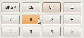
As the name suggests, Human-Clearlooks is based on the new GNOME Clearlooks
theme. Mousing over widgets turns them bright orange. This theme seems to be
unfinished; as you can see in the screenshot below, toolbars have a completely
blank background.

A nice feature in Human-Clearlooks is the focus indicator around widgets. The
dotted black squares have been replaced at last with something easier to see and
prettier. In this screenshot you can see a button being moused over as well as a
button with focus.

I’m hoping the default will be changed from Human-Murrine to Human-Clearlooks. They’re both nice (and need further tweaking), but I prefer the distinctive matte buttons over the shiny ones, as well as the pretty focus indicator.
Archived Comments
paul
very nice !haha ,good ,
joshsmith
when will people realise that blank toolbar backgrounds look nice and clean.
horizontal lines add clunk. they waste space, look ugly, and provide no useful
functionality
yeah, we get that things on different lines are different, we dont need a line
in the middle too tell us that again
Fabian
I really dislike the glossy look. That one thing (among others, of course) that always kept me away from KDE. IIRC that was en vogue in Web 2.0 around 2006⁄07 ;)
Chris Lees
Orange is occasionally nice, but since seeing those mockups I’ve been yearning for the luscious milk chocolate brown Ubuntu. These two new themes are just the bog-standard Human, in different theme engines.
Anon Y. Mouse
The default Ubuntu Human is still much better than either one of these new alternatives. If only Human would allow changing of color themes, it would be close to perfect in my opinion.
Ferk
aghh!!… I had hoped the orange color to change and get darker… this orange is not human..
6205
Stripped Murrina menu bar is nice, i like it from beginning of Murrina engine, but rest of that Murrine Human is bad….seriously. It is even more Orange and too much glossy. Current Human theme on Gutsy looks better.