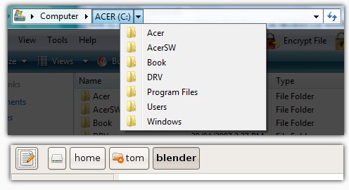
Folder Navigation in Vista & Nautilus
Most computers come with Windows Vista preinstalled, so I recently got a chance to play with Microsoft’s newest OS. (It only took 4 reboots to install!) One of the things I noticed was that the folder navigation in Vista’s file manager is very similar to Nautilus’ button-based location bar. The difference is that Vista’s is much more powerful.

The thing that both navigation bars have in common are the buttons. Clicking on a folder’s button opens that folder in the current window. In Windows Vista, there is an arrow beside each button. Clicking on the arrow drops down all of the folders in the same level and allows switching between them. In Nautilus, no equivalent feature to this exists. If I wanted to switch from a folder called “blender” in /home/tom to my “pictures” folder I would have to open the parent of the “pictures” folder in the main view. In Vista I could click the drop-down arrow and click “pictures” to do the same thing.
The other nice advantage to Vista’s navigation bar is that it looks like a text box, and when empty space is clicked it turns into a regular text-only location bar. Nautilus uses a separate button to do the same thing. In my opinion, the way Vista does it is more natural and quick.
Maybe the Nautilus developers will take some inspiration from Vista for a future release. The button view in Nautilus could be made a lot more useful.
Archived Comments
anklsaem
The first thing I do when I install Ubuntu is replace nautilus with thunar (and/or xfe).
Jack Kerouac
Agreed. Nautilus, in my opinion, is not great. It could use a little direction.